You may have heard that if you average together all colors on the web, you get orange. That may be true. But when you pull away the photographs of sunsets and the peachy skinned? You’re left with the visual framework of CSS, the text and menus and other graphic design elements of the web.
And that? That’s not orange. That’s blue.
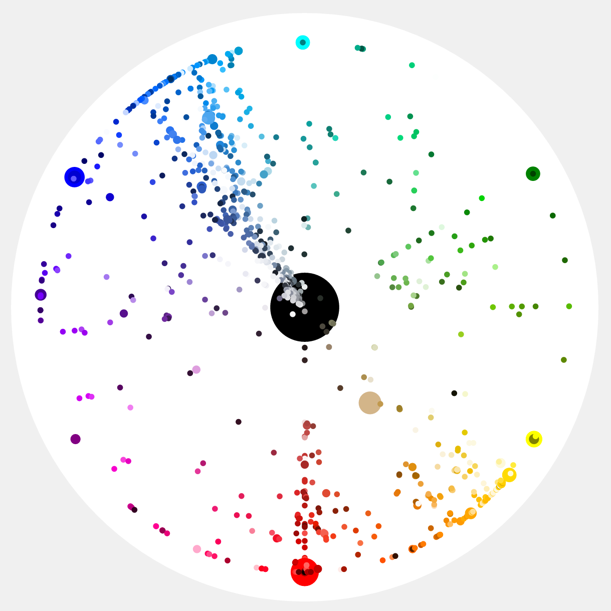
It’s a sentiment we’ve heard before; in 2014 John Herrman cataloged the subtle differences in blues among widely trafficked websites. The latest evidence comes courtesy of new visualizations by Paul Herbert, spotted by BoingBoing. He scraped the color codes from the world’s 10 top websites—which include noted blue aficionados Google, Facebook, and Twitter—and plotted them here.

—
[amazonjs asin=”B01G4N6CDK” locale=”JP” title=”Bose ワイヤレスノイズキャンセリングヘッドホン QuietComfort 35 密閉型/オーバーイヤー/Bluetooth・NFC対応/リモコン・マイク付き/通話可能 シルバー QuietComfort35 WLSS SLV【国内正規品】”]


